

Interactive map: Ohio’s COVID-19 advisory system
Below is Ohio’s COVID-19 Public Health Advisory System.The map is a color-coded system designed to supplement existing statewide orders through a data-driven framework to assess the degree of the virus’ spread and to engage and empower individuals, businesses, communities, local governments, and others in their response and actions.The system consists of four levels that provide Ohioans with guidance as to the severity of the problem in the counties in which they live. The levels are determined by seven data indicators that identify the risk level for each county and a corresponding color code to represent that risk level.Below is an interactive map showing where each county stands. The below map is accurate as of April 29.CAN’T SEE THE MAP BELOW? CLICK HERE.YELLOW: ALERT LEVEL 1: A county has triggered zero or one of the seven indicators, and there is active exposure and spread.ORANGE: ALERT LEVEL 2: A county has triggered two or three of the seven indicators, and there is increased risk of exposure and spread.RED: ALERT LEVEL 3: A county has triggered four or five of the seven indicators, and there is very high exposure and spread.PURPLE: ALERT LEVEL 4: A county has triggered six to seven of the indicators, and there is severe exposure and spread. Stay home as much as possible. There are seven different data indicators to determine the four levels, state officials said. Each data indicator helps identify the risk factor for each county. Those seven factors are as follows:NEW CASES PER CAPITA: When the data shows that a county has had an average of 50 cases per 100,000 people over a two-week period, that triggers a flag for an increasing case rate. Using this data means we are taking into account the population of a county when monitoring case increasesSUSTAINED INCREASE IN NEW CASES: If the number of new cases in a county continually increases, that’s another indicator of virus spread. A county will be flagged for meeting this indicator if the data shows at least a five-day period of sustained new case growth.PROPORTION OF CASES NOT CONGREGATE CASES: Data showing more than 50% of new cases originating from non-congregate settings during at least one of the past three weeks will trigger a flag on this indicator.SUSTAINED INCREASE IN ER VISITS: ER data will show us the trend in the number of people who visit an emergency department with COVID-19 symptoms or a COVID-19 diagnosis as a result of the visit. A county is flagged when there is an increase in such ER visits over a five-day period.SUSTAINED INCREASE IN OUTPATIENT VISITS: This data set looks at the number of people visiting outpatient settings, including telehealth appointments, with suspected or confirmed COVID-19 symptoms. A county is flagged when there is an increase over a five-day period.SUSTAINED INCREASE IN NEW COVID-19 HOSPITAL ADMISSIONS: When the numbers show at least a five-day period of sustained growth in the number of county residents with COVID-19 who are admitted to a hospital, the county will be flagged for meeting this indicator.ICU BED OCCUPANCY: This indicator looks at regional data for both COVID-19 and non-COVID-19 use of ICU beds. A county is flagged for this indicator when the regional ICU occupancy goes above 80% for at least three of the last seven days.
Below is Ohio’s COVID-19 Public Health Advisory System.
The map is a color-coded system designed to supplement existing statewide orders through a data-driven framework to assess the degree of the virus’ spread and to engage and empower individuals, businesses, communities, local governments, and others in their response and actions.
The system consists of four levels that provide Ohioans with guidance as to the severity of the problem in the counties in which they live. The levels are determined by seven data indicators that identify the risk level for each county and a corresponding color code to represent that risk level.
Below is an interactive map showing where each county stands. The below map is accurate as of April 29.
CAN’T SEE THE MAP BELOW? CLICK HERE.
YELLOW: ALERT LEVEL 1: A county has triggered zero or one of the seven indicators, and there is active exposure and spread.

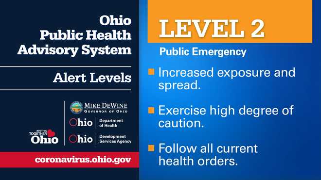
ORANGE: ALERT LEVEL 2: A county has triggered two or three of the seven indicators, and there is increased risk of exposure and spread.
RED: ALERT LEVEL 3: A county has triggered four or five of the seven indicators, and there is very high exposure and spread.

PURPLE: ALERT LEVEL 4: A county has triggered six to seven of the indicators, and there is severe exposure and spread. Stay home as much as possible.

There are seven different data indicators to determine the four levels, state officials said. Each data indicator helps identify the risk factor for each county. Those seven factors are as follows:
- NEW CASES PER CAPITA: When the data shows that a county has had an average of 50 cases per 100,000 people over a two-week period, that triggers a flag for an increasing case rate. Using this data means we are taking into account the population of a county when monitoring case increases
- SUSTAINED INCREASE IN NEW CASES: If the number of new cases in a county continually increases, that’s another indicator of virus spread. A county will be flagged for meeting this indicator if the data shows at least a five-day period of sustained new case growth.
- PROPORTION OF CASES NOT CONGREGATE CASES: Data showing more than 50% of new cases originating from non-congregate settings during at least one of the past three weeks will trigger a flag on this indicator.
- SUSTAINED INCREASE IN ER VISITS: ER data will show us the trend in the number of people who visit an emergency department with COVID-19 symptoms or a COVID-19 diagnosis as a result of the visit. A county is flagged when there is an increase in such ER visits over a five-day period.
- SUSTAINED INCREASE IN OUTPATIENT VISITS: This data set looks at the number of people visiting outpatient settings, including telehealth appointments, with suspected or confirmed COVID-19 symptoms. A county is flagged when there is an increase over a five-day period.
- SUSTAINED INCREASE IN NEW COVID-19 HOSPITAL ADMISSIONS: When the numbers show at least a five-day period of sustained growth in the number of county residents with COVID-19 who are admitted to a hospital, the county will be flagged for meeting this indicator.
- ICU BED OCCUPANCY: This indicator looks at regional data for both COVID-19 and non-COVID-19 use of ICU beds. A county is flagged for this indicator when the regional ICU occupancy goes above 80% for at least three of the last seven days.